Rose Hill, the glistening 45-story luxury residential project rising in NoMad developed by the Rockefeller Group, is a building with a New York attitude. Inspired by the Rockefeller family legacy, CetraRuddy was determined to build a contextual modern building that tipped its hat to its rich past (think not just a little tip of the hat, but the tip of a top hat that rolls from your head to hand when in a deep courtesy).
CityRealty interviewed Nancy Ruddy to learn what inspired Rose Hill. Ruddy explained the painstaking research to achieve their top priorities to respect the legacy of quality the Rockefellers, to uphold the true spirit of New York City, and honor the diversity of the neighborhood. All of this is wrapped in a modern building that innovatively features aspects of historic design to incorporate into both the exterior and interior design. Rose Hill goes beyond a residential building to one inspired by history with the goal of being a beacon to the future.
What inspirations did you get from the Rockefeller family’s legacy?
In thinking about how we designed their first residential building in Manhattan, we felt a great responsibility to the Rockefeller name. The Rockefellers have a legacy of excellence from real estate, art, and culture with icons such as Rockefeller Center, the Museum of Modern Art and Rockefeller University. Everything they did was of the highest quality and we felt it was important to continue that legacy. Rose Hill embodies that legacy in both the exterior expression and interior design. Materiality was also important; the Rockefellers are known for incorporating the highest quality materials in everything they have built, whether it was museums, educational buildings or their homes. When you look back at their contributions 50-75 years later they have a stature, gravitas, beauty and the aspiration of creating excellence. It was not about doing something that is fashionable but rather creating buildings that have integrity and grace.
That is the direction we took with this building. When you think about Rockefeller Center being built in the 1930’s, at the height of the Depression, it was built as a symbol of optimism. That was such a bold move then and it is still the center of New York. They combined art and architecture and that was key to us.
Our inspiration had two major determinants: to honor the Rockefeller legacy and to design a building that was part of its neighborhood’s context and the great traditions of New York City’s iconic towers. We were drawn to this idea of Rockefeller Center as an icon on the Manhattan skyline. So we started calling this building by a temporary name, “Gotham.” For us, whether in comic books or early writings about New York City, it evoked the spirit of New York. We wanted to do something that was forward-thinking and modern while encapsulating the magic of this city. When you think of Marvel comics and the great art and great buildings of New York City, we wanted to create a form that engages the skyline and will become an important icon. It takes us back to the 1930’s era of great buildings from Rockefeller Center to the Empire State Building and the Chrysler Building. All of these factors added up into how we designed this residential building.
NoMad has been a particularly active section of New York. How did this inspire Rose Hill?
There are a lot of new buildings going up in NoMad, our neighborhood, that are all glass and could have been built in Los Angeles or Detroit or another part of Manhattan. We wanted to create a contextual building so we questioned, how do we create a 45-story building that is part of the context? We walked the neighborhood and spent a lot of time there. There are buildings built in NoMad from 1890-2018 but the older buildings are a composition of different styles with a lot of masonry and earth tone colors. Instead of using full glass walls, or blue or grey glass, we created a palette of metallic bronze and browns that are similar colors to the context. We wanted it to be of the neighborhood. NoMad is a very special neighborhood, filled with culture, art, literature, and music. This intermingles into the discussion of what the area’s history inspired.
Our approach was influenced by a combination of the context of all these buildings, even tenement buildings, that have beautiful architectural details and patterns from the 1920’s through the 40’s. When the sun shines on the three-dimensional patterning of those buildings, the light and shadows created are magical. We made the decision to design a modern building with a pattern on its three-dimensional qualities. The pilasters are 3D so they will catch the light differently in the morning than at sunset. It will be a modern building with all the things we love about architecture from the past.
What makes a building “modern”?
To us, a modern building is something that is very tall–higher than six or even 20 stories–and very sustainable with a low carbon footprint using high-tech materials. So the question is, how do we take high-tech materials, like metal and glass, and create sustainability in a way that reflects the intricacies of a thick masonry wall? We created all the detailing in metal, which is lighter than masonry, and articulated it so it turns and has corners instead of being flush, creating interesting shadow patterns. We created the windows to be set back with metal surrounds. Also, we didn’t do floor-to-ceiling glass. The windows are very large but they are all surrounded by metal trim to be referential to an older building. The windows are 9’2 x 11’10, so they are really large but when you look at the elevation of the building, they appear as punched openings, which is very classic. We wanted to give residents maximum light, air, and views but surround the windows with trim. So it is modern with larger glass components but with articulation that gives it that older world beauty.
Inspiration for the building’s exterior was found in the period of Rockefeller Center and in the actual Rockefeller Center’s exterior and interiors, where there is a predominant use of chevron shapes. We have chevron patterns on the outside of the building, and on the vertical pilasters, the three-dimensional chevron shapes will cast shadows. All of our balcony railings have chevron patterns on them. People at street level and people up in nearby buildings will all be able to see that. This is one of the things that we’re really proud of and think is very different – we combined a tall building with beautiful detailing. Any of the apartments that have terraces will see that. But even if they don’t have terraces, they will be able to see those railings throughout. The base of the building is highly articulated with chevron and two different color stones that combine with patinated bronze on the bottom. When you walk in and out of the building every day, you will see the design of the building coming all the way down to the ground. In the lobby, there is a very large column holding up the center of the building and it is encased in antique bronze which we have incised the chevron pattern into it. It will be lit beautifully. Everything you touch is your home in the building, from the moment you enter the front door. Residents will get a sense of pride. It is a very special building.
We created the tower in the great tradition of the American skyscraper. Louis Sullivan built the first skyscraper in Chicago. At the time it was about 14 stories and it was the first time they used steel for structures. Sullivan looked at classical architecture, specifically, Greek and Roman, and found that as buildings got taller, they consist of three components: a base, a shaft, then a crown. Those three elements are very classical in nature and were applied to Louis Sullivan’s early skyscrapers. You can also see that in New York City’s early skyscrapers. They have articulated bases at the pedestrian levels of the buildings, they have shafts of 10-40 stories, and they end in a beautiful crown on top of the building. This articulation makes a 45-story building more gracious within a mid and low rise neighborhood. We were fortunate to have a client who understood that and knew that to create a new addition to the New York skyline we had to be responsible about what we were adding. The building’s crown is very articulated which breaks down the mass with both vertical and horizontal pieces with embedded light. It will feel like a beacon or torch.
How did the historic Rose Hill neighborhood inspire you?
I had never heard of Rose Hill as most of us had not. Before our research, we thought we were designing a building in NoMad, which we are, which has a special connotation to New Yorkers. NoMad has become an intellectual center of the city. It is hip yet understated. It is an area a lot of writers and artists and fashion designers have lived. I think it’s really interesting that when Rizzoli, which moved after being on 57th Street forever, chose to move to NoMad. That says a lot.
When our team started researching this area, we discovered the area was originally a farm owned by John Watts in 1747. He had 131 acres with an elegant home, a barn, outbuildings, and stone walls. Then, in 1790, he sold 92 of the 100-acre estate, the original property went all the way to the East River. Funnily enough, when he bought the property, it was considered “three miles north of New York City!” It was in the country. The Rockefeller Group and the whole team decided that Rose Hill was a name that had been forgotten so they named it that because it is in the center of this historic neighborhood before it started to be developed. Couple that with the Rockefeller name, “R” for Rose and Rockefeller, and I joke the “R” is also for Ruddy.
Using a name to keep the spirit of the neighborhood history alive was a great idea because it helps you remember the past of how Manhattan developed. What was Rose Hill, now NoMad, developed over time from the mid-18th century up until now? Unlike parts of the Upper East Side where a number of brownstones were built at one time, or the West Side in the era when all residential buildings were built, here the buildings were built one at a time. Therefore, there are many architectural styles, stone, brick, black metal, and a little bit of bronze. The context really affects the materials we selected. For us, we do architecture and interior design so the essence of the exterior architecture is brought inside the building. We incorporated the diversity of style and creativity and freedom, the area was known for.
The first “modern” building in the area was Stanford White’s Colony Club. That is when the area started to get more upscale. Our goal was to be a contextual building but the debate is always how can a building be contextual if it’s tall? But the reality of our current world is that buildings are tall. One of the things we’re most proud of is that when you walk down the street, you’ll feel the building is modern but also that maybe it has been here for a while. And as far as the character, the building has an attitude. It is not anonymous. We wanted the building to have its own personality. Evoking Gotham, living in New York, being creative, relating to the history of living in this city…we carried all of that inside the building.
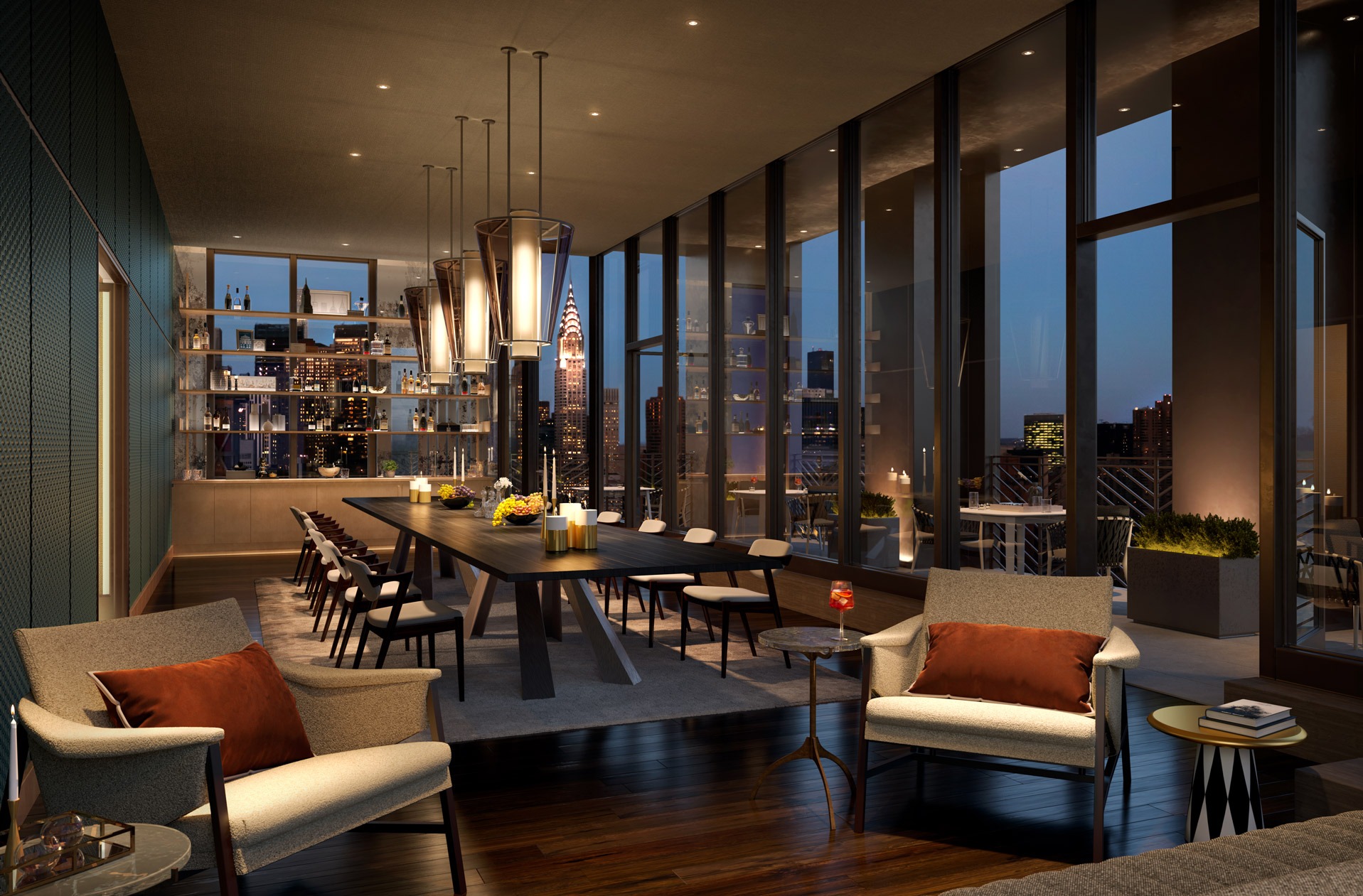
When you walk in and see the lobby, it is meant to be a space that welcomes. You enter through a very articulated facade and then come into this other world off the street that is warm with a tapestry of material. We don’t literally have tapestries but we studied floor patterns from the 1930’s and 40’s that inspired the floor in the lobby. which is made up of eight different earth tone stones. It is a modern interpretation of a number of traditional mosaic patterns. The larger scale feels modern. We used yellowstone, onyx, and grey stones that aren’t popular stones now but we use them because they have this warm sueded feeling and interesting colors. Similarly, all the walls are hand-rubbed walnut. We used burnished leather and antique bronze and have a huge fireplace that will be on 12 months of the year. The idea is you come into this building and there is a seamless continuation on the inside of what is designed on the outside.
We thought of the lobby space more as hospitality with social spaces and community, not just a walk-through space. There are a lot of cozy areas to sit, read the lobby’s extensive selection of books, have a drink and socialize with friends. We also commissioned a 30-foot, eight or nine-foot-tall lobby mural that tips its hat to the murals of Rockefeller Center.
Were there any other objects, ideas, music or other concepts that you found inspiring to inform any aspects of your design?
We have incorporated art throughout the building. We feel the residents here will be very elevated. I am not sure why but we just assume people who love art, literature, and technology, people who care about content, will gravitate to this building. There is nothing that is about fashion here in the sense that the building’s beauty will last throughout time. We designed a beautiful bronze sculptured art screen that divides lobby from the Blue Room library and we have a curated art collection that will be owned by the condominium owners. Even the mail room will have a curated selection of photography.
Art is carried through the pool design, which is based on the greatest, most beautiful pools of the 30’s and 40’s in New York City which were in the public baths and the YMCAs. They had pools with beautiful mosaics with hand wrought tiles and trim. Our pool has deep turquoise handmade tiles from Vermont. We went even further and there’s an end wall which we took inspiration from the Spirit of Normandy ship, which was the most beautiful ever, and created and designed an amazing end wall that is a mosaic of women, Amazon goddesses of the 30’s swimming. The spirit of the building, whether you are art knowledgeable or not, is to love living with beauty and to want to be inspired.
Other influences we had was the amazing amount of artists and musicians that lived in NoMad. We really viewed this building as a reference to the Jazz Age. We have speakers throughout the public spaces and I am hoping they will have someone curate music so there is subtle jazz playing as you come into the lobby.
How did you approach the design of the apartments?
When it came to the individual apartments, we wanted to have a sensitivity for people’s own individual style. Someone may love midcentury modern, someone else will lean toward New England farmhouse style. So we’re always very careful to design spaces that are a backdrop to people’s lives and style. We have created homes that are very loft-life. Thinking of Gotham and what we love about New York, we have all had this dream of living in an artist’s loft. It may be a romantic vision, but we explored how to make an apartment with two-to-three bedrooms to be flexible for people’s lives.
We selected a wood floor that is a little more rustic than you’re used to seeing in a new development. Everyone is doing light floors to reflect light but here, we picked a mid-tone color that is variegated so it is darker in some places and lighter in others. Some pieces even have knots in them. It has a real character. We know that people start with white walls and thought it would be great to have a beautiful floor with a character that feels good underfoot. I always walk around barefoot in my apartment. When we select floors, I always take my shoes off to see how it feels. These floors have texture and character. Since flooring material is the one material there is more of in an apartment, we wanted to make a curated choice. All selections in the apartments are very elemental. There is no polished stone, all the stones are honed with no shine. The way we put together beautifully crafted materials culminates in crafted unique details. We take pride in that. The countertops are not just one slab, they are connected to the base with a little bronze detail which is something very simple and elemental but the luxury really comes from how it is put together. The homes are a beautiful medley of material.
We put Breccia in master baths, which is a white-based stone with beautiful, very dramatic veins with grey and little bits of burgundy and green. Every master bath has a shower with a feature wall. It is gutsy which goes along with the sense of attitude this building has. We know that buyers visit a lot of buildings and after a while, they all start to look the same. This building is very NoMad and downtown. It is distinctive, but what we have done is we’ve respected the ability to allow people’s own personality to shine.
No matter how much we all try to simplify our lives and purge of things, we all have “stuff” in our lives and things that happen in rooms other than bedrooms and living rooms. To accommodate this, we have created “flex spaces” which are different sizes but most of them are 8’x10’. We designed them to be used for home offices, gyms, baby’s rooms, music rooms or whatever, and they can change as families grow. We try to respond to modern living. People now use their apartments very differently than they used to and we wanted apartments people could adapt to their lifestyle. We added these flex spaces which have doors that can always be open or you could close them to have a conversation, enjoy media or put wild paint colors on the walls. We’re really excited about them. In our sales center, you can see virtual flex spaces that we decorated in three different ways, as a children’s room, a music room, and as a home office/library. We wanted to show how you can take a compact space and do different things with it as your life changes. It can be a library and then you have a baby and it’s big enough for a crib, a rocking chair, and a changing table. It was essential we design living spaces for how people live and make sure to provide meaningful spaces and not just the latest trends, like gold faucets. The design is not about design trends or fashion, it is about authenticity and substantive content.